Last year I began the 52 Week Illustration Challenge but didn't get past week 2 letting life get in the way.
This year I recommit to doing the challenge and I have even been brave enough to post to the group. I'm concerned that I might fall behind again to the busyness of life for the first few months but I believe that it is important to keep trying.
So here I am poised again to try to fly.
Week 49: Purple

Materials used:
- Arches Watercolour Paper, Medium 300gsm
- 0.8 Staedtler pigment liner; Black
- Pencil H Staedtler
- Posca Pens (Pin Type 0.7mm, Bullet Shaped 0.9-1.3mm & 1.8-2.5mm)
- Black
- Violet
Week 48: Africa

Materials used:
- Arches Watercolour Paper, Medium 300gsm
- 0.8 Staedtler pigment liner; Black
- Pencil H Staedtler
- Posca Pens (Pin Type 0.7mm, Bullet Shaped 0.9-1.3mm & 1.8-2.5mm)
- Black
Week 43: Friend

Materials used:
- Arches Watercolour Paper, Medium 300gsm
- 0.5 Staedtler pigment liner; Black
- Water colour paints
- Art Spectrum
- Lemon Yellow
- Yellow Ochre
- Cadmium Yellow
- Rose Madden
- Cadmium Red
- Alizarin Hue (Permanent Crimson)
- Neutral Tint
- Burnt Sienna
- Phthalo Blue
- Ultramarine Blue
- Antwerp Blue
Week 42: Door

Materials used:
- Arches Watercolour Paper, Medium 300gsm
- 0.5 Staedtler pigment liner; Black
- Staedtler Triplus Fineliner Brilliant Colours 0.3mm
- Water colour paints
- Art Spectrum
- Lemon Yellow
- Yellow Ochre
- Cadmium Yellow
- Rose Madden
- Cadmium Red
- Alizarin Hue (Permanent Crimson)
- Neutral Tint
- Burnt Sienna
- Phthalo Blue
- Ultramarine Blue
- Antwerp Blue
Week 41: Bookshop

Materials used:
- Arches Watercolour Paper, Medium 300gsm
- 0.5 Staedtler pigment liner; Black
- Staedtler Triplus Fineliner Brilliant Colours 0.3mm
- Water colour paints
- Art Spectrum
- Lemon Yellow
- Yellow Ochre
- Cadmium Yellow
- Rose Madden
- Cadmium Red
- Alizarin Hue (Permanent Crimson)
- Neutral Tint
- Burnt Sienna
- Phthalo Blue
- Ultramarine Blue
- Antwerp Blue
Week 40: Rope

Materials used:
- Arches Watercolour Paper, Medium 300gsm
- 0.8 Staedtler pigment liner; Black
- White (UM-120AC Angelic Colour), Uni-ball Signo, Mitsubishi Pencil Co.
- Pencil H Staedtler
- Posca Pens (Pin Type 0.7mm, Bullet Shaped 0.9-1.3mm & 1.8-2.5mm)
- Black
Week 38: Jump
The Parachuting Hens.
The sketch was drawn on the plane flight from Perth to Canberra.
The sketch was drawn on the plane flight from Perth to Canberra.

Materials used:
- A4, Quill sketch book
- 0.8 Staedtler pigment liner; Black
- White (UM-120AC Angelic Colour), Uni-ball Signo, Mitsubishi Pencil Co.
- Pencil H Staedtler
- Posca Pens (Pin Type 0.7mm, Bullet Shaped 0.9-1.3mm & 1.8-2.5mm)
- Black
Illustration in development.


Week 37: Queen
Queen of the Pond
This illustration was created on my plane flight from Canberra/Melbourne to Perth.

Materials used:
- A4, Quill sketch book
- 0.05 - 0.8 Staedtler pigment liner; Black
- White (UM-120AC Angelic Colour), Uni-ball Signo, Mitsubishi Pencil Co.
- Pencil H Staedtler
Illustration in development.


- A4, Quill sketch book
- 0.05 - 0.8 Staedtler pigment liner; Black
- White (UM-120AC Angelic Colour), Uni-ball Signo, Mitsubishi Pencil Co.
- Pencil H Staedtler
Illustration in development.

Week 36: Printing
Raining cats and dogs.
For this week's illustration I wanted to create something that could become elements for a stencil. Later I would like to explore reprinting this design in a variety of colours where the clouds, cats and dogs are in a monotone colour (like this one black on white) on coloured paper OR printed in a variety of colours.

Materials used:
- Posca Pens (Pin Type 0.7mm, Bullet Shaped 0.9-1.3mm & 1.8-2.5mm)
- Black
- A3, Paper medium weight, Como Sketch Pad
Illustration in development.


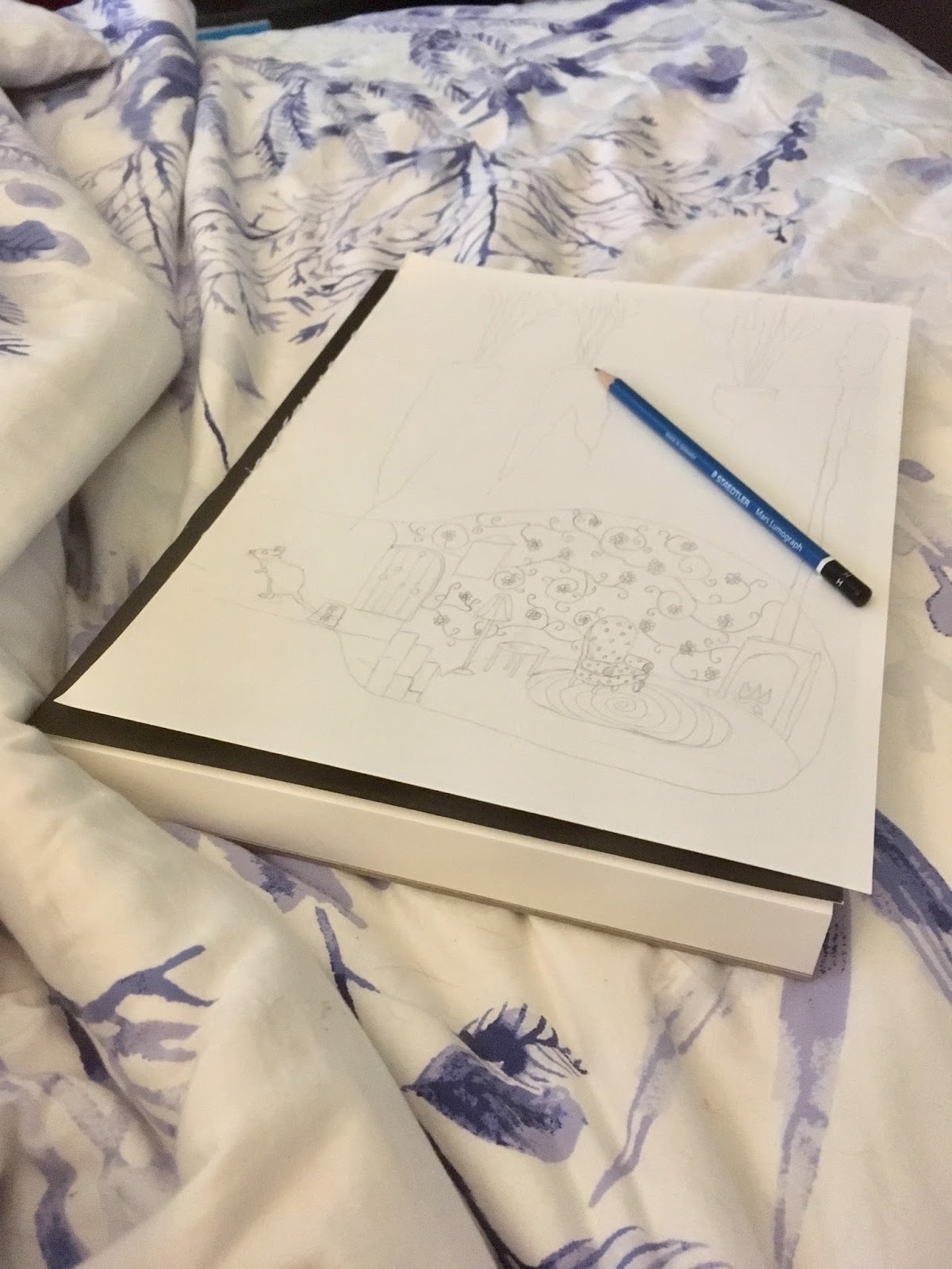
Week 30: Home
Mouse's House underneath the veggie patch.
This was one of those pictures inspiration just hit me and I drew it in bed before I began my day.
It however is unfinished and without colour as I ran out of time to complete the illustration before flying to Melbourne.

Materials used:
- 0.05 Staedtler pigment liner; Black
- 0.6mm Fine Staedtler Lumoclour permanent; Blue 318-3
- A4, Watercolour Paper 300gsm, medium, cold pressed, Canson Artist Series
Illustration in development.
Week 29: Swing
This week I wanted to focus on doing a more 'illustrative' type of picture. I decided to have a girl swing off a rope into water.

Materials used:
- 0.05 Staedlter pigment liner
- Watercolour Paper 300gsm, medium, cold pressed, Canson Artist Series
- Water colour paints
- Winsor & Newton
- Lemon Yellow Hue
- Cadmium Yellow Pale Hue
- Cadmium Yellow Hue
- Gamboge Hue
- Permanent Rose
- Mayve
- Yellow Ochre
- Sap Green
- Cerulean Blue Hue
- Raw Umber
- Raw Sienna
- Burnt Sienna
- Burnt Umber
- Chinese White
Illustration in development.


Week 27: Bush Countryside
There were a lot of ideas swirling around in my head for this theme, since I lived on farmland for more than 15 years, grew up on the edge of farmland and visited the family hobby farm as a child.
The distant hills, the mid-ground of farmland with its lone paddock tree and leaning on fences made out of wood from local trees are very strong images for me. We may have farmed sheep but a lone cow seemed right for this illustration.

Materials used:
- 0.2 Staedlter pigment liner
- Watercolour Paper 300gsm, medium, cold pressed, Canson Artist Series
- Water colour paints
- Winsor & Newton
- Lemon Yellow Hue
- Cadmium Yellow Pale Hue
- Cadmium Yellow Hue
- Cadmium Red Pale Hue
- Cadmium Deep Red Hue
- Yellow Ochre
- Raw Sienna
- Hooker's Green Dark
- Emerald
- Intense Green (Phthalo Green)
- Cerulean Blue Hue
- Cobalt Bule
- Raw Umber
- Light Red
- Indian Red
- Burnt Umber
- Chinese White
- Lamp Black
- Payne's Gray
Illustration in development.


Week 26: San Francisco
For me San Francisco is the Golden Gate Bridge, cable cars, information technology companies like Cisco and the iconic houses on the tv shows Full House and Charmed.

When you view the progress photos you will see that the yellow houses are now lilac and the foreground was changed to green with hints of violet.
Materials used:
- Canson: Artist series - Acrylic paper - 245 gsm
- Posca Pens (Pin Type 0.7mm, Bullet Shaped 0.9-1.3mm & 1.8-2.5mm)
- White
- Black
- Light Blue
- Green
- Lilac
- Violet
- Yellow
- Red
- Pink
- Acrylic paints
- Art Culture
- White
- Reeves
- Titanium White
- Blue Lake
- Phthalo Blue
- Viridian Hue
- Phthalo Green
- Violet
- Lemon Yellow
- Medium Yellow
Illustration in development.


Week 25: Past
This was one of those weeks where the idea of dinosaurs came to me straight away. The picture developed in my head for a few days and then it was ready to sketch with very little changes in the composition.
(Thanks to my son for helping me adjust the colours in the scanned image of the illustration so the sky and ground colour show up like on the painting.)

Materials used:
- 0.2 Staedlter pigment liner
- Watercolour Paper 300gsm, medium, cold pressed, Canson Artist Series
- Water colour paints
- Winsor & Newton
- Cadmium Yellow Pale Hue
- Cadmium Red Pale Hue
- Yellow Ochre
- Raw Sienna
- Sap Green
- Hooker's Green Dark
- Emerald
- Viridian Hue
- Intense Green (Phthalo Green)
- Cerulean Blue Hue
- Raw Umber
- Burnt Sienna
- Chinese White
- Lamp Black
- Payne's Gray
Illustration in development.


Week 24: Multiculturalism
This week I wanted to show my Polish heritage. This illustration shows the national dress that my aunts, my little sister and I have all worn. My Polish grandparents arrived in Australia in 1950.

Materials used:
- Pencil HB
- Canson: Artist series - Acrylic paper - 245 gsm
- Acrylic paints
- Reeves
- Titanium White
- Brilliant Red
- Lake Blue
- Orange
- Mars Black
- Paynes Gray
- Yellow Ochre
- Burnt Sienna
- Viridian Hue
- Light Green
- Violet
- Flesh Tint
- Lemon Yellow
- Medium Yellow
Illustration in development.


Week 23: Texture
This week's illustration comes from the art class I did with Sylvia Marris.
Once I completed the piece I felt wow that has great texture so here is my whimsical painting. This is a style I'd really like to explore again the parring back to shape and line to create images.

Materials used:
- Canvas
- Acrylic paint; Variety of brands and applications - tube, pens and liquid
- yellows
- pinks
- orange
- blue
- purple
- black
- white
- Gesso - white
- Stencils
- Paint brushes and sponges


Week 21: Red
All around Canberra during autumn most to the colours in the landscape are from the autumn leaves falling. Discovering a flowering eucalypt tree and it's red flowers made a wonderful change.
Materials used:
- Pencil HB
- Watercolour Paper 200gsm, cold pressed, Winslow Aquarelle (The Paper House)
- Gouache
- Winsor & Newton: Designer Gouache - Permanent White
- Water colour paints
- Art Spectrum
- Lemon Yellow
- Cadmium Red
- Australian Leaf Dark Green
- Australian Green Gold
- Burnt Sienna
- Ochre Yellow
Drawing in development.


Photo used to inspire illustration.

Catch-up: Week 16: Experiment
My hair wasn't always blue.The experiment was also using brown paper and acrylic paint (not used this medium for 20+ years)

Materials used:
- Pencil HB
- Brown Paper (Kraft Wrap - artwrap)
- Acrylic paints
- Reeves
- Titanium White
- Brilliant Red
- Lake Blue
- Orange
- Mars Black
- Yellow Ochre
Drawing in development.


Week 19: Music
The Music Fairy played her lute, she took the notes and placed them on the score.

 |
| Close-up of the Music Fairy |
Materials used:
- Pencil HB
- Watercolour Paper 200gsm, cold pressed, Winslow Aquarelle (The Paper House)
- 0.2 and 0.8 Staedlter pigment liner
- Gouache
- Winsor & Newton: Designer Gouache - Permanent White
- Water colour paints
- Winsor & Newton
- Winsor Potter Pink
- Art Spectrum
- Ultramarine Blue
- Cadmium Red
- Hookers Green
- Ceralean Blue
- Burnt Sienna
- Raw Sienna
- Ochre Yellow
Illustration in development.


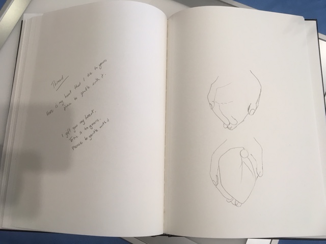
Week 15: Thread
I gift you my heart.
To tie my heart's thread to yours.
Please be gentle with it.

Materials used:
- Pencil HB
- Watercolour Paper 200gsm, cold pressed, Winslow Aquarelle (The Paper House)
- Gouache
- Winsor & Newton: Designer Gouache - Permanent White
- Water colour paints
- Winsor & Newton
- Winsor Potter Pink
- Winsor Red
- Art Spectrum
- Ultramarine Blue
- Alizarin Hue Crimson
- Lamp Black
- Raw Sienna
- Ochre Yellow
Illustration Thoughts.
I was inspired by the idea of a thread linking your heart to things you love and was originally planning to do a heart linked to my passions by a thread. Then the illustration idea developed into;- The giving of your heart to the person you love and how this ties you together, a thread connecting you forever.
- The image of the picture of Mary's Sacred Heart on my Grandmother's beside table.
- Then the memory of the heart drawings by Michelangelo.
- and finally the tying of a ribbon around the hands in some wedding ceremonies.
So the image became someone holding out their heat with a ribbon around it formulated in my mind.
Photo used to inspire illustration.

Illustration in development.


Week 14: Surprise
What big ears you have Granny! What a surprise it must have been for Little Red Riding Hood to find The Big Bad Wolf in Granny's bed.
This illustration was a surprise too. It was just one of those ideas that hits you and you draw it up quickly as a fully formed idea. The idea came to me while working on the sky for the week 11 drawing, so aside went week 11's drawing and here is week 14.
And on time!

Materials used:
- Pencil HB
- Watercolour Paper 200gsm, cold pressed, Winslow Aquarelle (The Paper House)
- 0.2 Staedlter pigment liner
- Gouache
- Winsor & Newton: Designer Gouache - Permanent White
- Water colour paints
- Winsor & Newton
- Winsor Potter Pink
- Art Spectrum
- Ultramarine Blue
- Cadmium Yellow
- Hooker Green
- Lamp Black
- Raw Sienna
- Burnt Sienna
- Neutral Tint
- Ochre Yellow
Illustration in development.


Week 13:Cinema
Will be in catch up week, ideas running though my mind.
Week 12: Happy Place
Idea at thought stage.
Week 11: Perspective
In progress...

Materials used:
- Pencil HB
- Cotman Water Colour Paper 300gsm, Fine grain, cold pressed, gummed (Winsor & Newton)
- Vaseline
- Derwent Drawing Pencils
- Light Sienna 1610
- Solway Blue 3615
- Ink Blue 3720
- Smoke Blue 3810
- Pale Cedar 4125
- Wheat 5715
- Ivory Black 6700
- Warm Grey 7010
- Cool Grey 7120
- Chinese White 7200
- Derwent Coloursoft Pencils
- Grey Lavendar C220
- Mid Green C400
- Dark Green C410
- Light Green C440
- Lime green C460
- Persian Grey C660
- Dove Grey C670
- Mid Grey C700
- White Grey C710
- Derwent Artists Pencils
- Grass Green 4700
- May Green 4800
- Cedar Green 5000
- Blue Grey 6800
- Gunmetal 6900
- Storm Grey 6910
- French Grey 7000
- Fell Mist 7110
Family Photos used to inspire illustration.


Illustration in development.


Week 10: Weekend
Last week I illustrated a retro housewife with a baked cake. This week the theme continues with a children's birthday party that are generally held on the weekend, this one includes the game Pin the Tail on the Donkey.I used to love birthday parties when my son was little. I would spend a month or more planning the party with a theme chosen by the both of us. We would have Pin the Tail on the ??? (donkey, puss-in-boots, Pilchard, sail on the pirate ship etc.) I'd make up games or craft based on the theme. We would decorate the house based on the theme and have theme appropriate food. I would cook the cake then supervise my husband who always wanted to decorate the cake. It was sooo much fun.

Materials used:
- Pencil HB
- Watercolour Paper 200gsm, cold pressed, Winslow Aquarelle (The Paper House)
- 0.2 Staedlter pigment liner
- Gouache
- Winsor & Newton: Designer Gouache - Permanent White
- Water colour paints
- Winsor & Newton
- Winsor Yellow
- Winsor Potter Pink
- Art Spectrum
- Raw Sienna
- Burnt Sienna
- Neutral Tint
- Ochre Yellow
- Lemon Yellow
- Cadmium Yellow
- Cadmium Red
- French Ultramarine
- Ultramarine Blue
- Cerulean Blue
- Hooker Green
- Lamp Black
Illustration in development.


Week 9: Baking
This week I was inspired by the idea of a retro housewife from the 1950s.The hardest aspect of this illustration was being happy with the body proportions then adding in the legs, feet and shoes.

Materials used:
- Pencil HB
- Watercolour Paper 200gsm, cold pressed, Winslow Aquarelle (The Paper House)
- 0.2 Staedlter pigment liner
- Gouache
- Winsor & Newton: Designer Gouache - Permanent White
- Water colour paints
- Winsor & Newton
- Winsor Yellow
- Winsor Potter Pink
- Art Spectrum
- Raw Sienna
- Burnt Sienna
- Neutral Tint
- Ochre Yellow
- Cadmium Red
- French Ultramarine
- Ultramarine Blue
Illustration in development.


Week 8: Pastel
Sturt's Desert Pea (Alice Springs, N.T., Australia)

I have never used pastels to create a whole picture before. When I saw this week's topic I knew that I wanted to challenge myself and keep my skills growing. So I chose the medium of pastel rather than pastel colours. I used many techniques that I learnt from the tutorials for pencil drawings; blending using a blending stump and adding colour to make sure to fill the paper tooth with pigment all the while trying not the burnish the paper.

Materials used:
- Pencil HB
- Sketch Paper 110gsm, even surface, heavyweight backing cartridge paper (Jasart)
- Derwent Pastel Pencils
- French Grey Dark P650
- Cadmium Red P130
- Carbon Black P710
- Crimson P160
- Conte a Paris Pastel Pencils 1355
- 003
- 050
- 39
- Faber Castell Pastel Pencils
- 1122-118
- 1121-225
- Rembrandt Soft Pastel
- Carmine 318,5
- Permanent Red Deep 371,5
- Permanent Red 372,5
- Madder Lake Deep 331,5
- White 100,5
- Permanent Yellow Green 633,5
- Permanent Green Light 618,9
- Permanent Green Deep 619,9
- Cinnabar Green Deep 627,8

Illustration in development.


Week 7: Botanical
Eucalyptus gumnuts. (Alice Springs, N.T., Australia)Just as I was about to print the photo that I was planning to base my illustration on when I saw a gumnuts photo and decided that it would suit the 'botanical' theme well.

Materials used:
- Pencil HB
- Sketch Paper 110gsm, even surface, heavyweight backing cartridge paper (Jasart)
- 0.8, 0.5, 0.2 Staedlter pigment liner
- Derwent Drawing Pencils
- Light Sienna 1610
- Cool Grey 7120
- Solway Blue 3615
- Smoke Blue 3810
- Green Shadow 4135
- Wheat 5715
- Yellow Ochre 5720
- Mars Orange 6210
- Mars Violet 6470
- Ruby Earth 6510
- Venetian red 6300
- Olive Earth 5160
- Chocolate 6600
- Crag Green 5090
- Chinese White 7200
- Derwent Metallic Pencils
- Metallic Sliver 80
- Derwent Coloursoft Pencils
- Dove Grey C670
- White Grey C710
- Pimento C540
- Derwent Artists Pencils
- Bright Red 1410

Additional Resources: I watched the You Tube videos to get guidance in using colour pencils.
- 12 Blending Tips for Colored pencils by Cher Kaufmann
- Top 7 Colored Pencil Mistakes that Beginners Make by Lisa, Lachri Fine Art
Illustration Thoughts.
In the future I need to select paper more carefully. This time I chose paper suitable for pencil and pen illustration. Later on I realised that my drawing would need colour and that watercolours wouldn't work very well on the paper I had chosen. I decided to stretch myself and use colour pencil, which I haven't used since week 1. On making this decision I knew that I would need to research how to create a better pencil drawing than I had produced before, see later for links.
In 7 weeks I can see that my skills have begun to develop and I am beginning to understand some of my chosen materials better.
Family Photos used to inspire illustration.

Illustration in development.


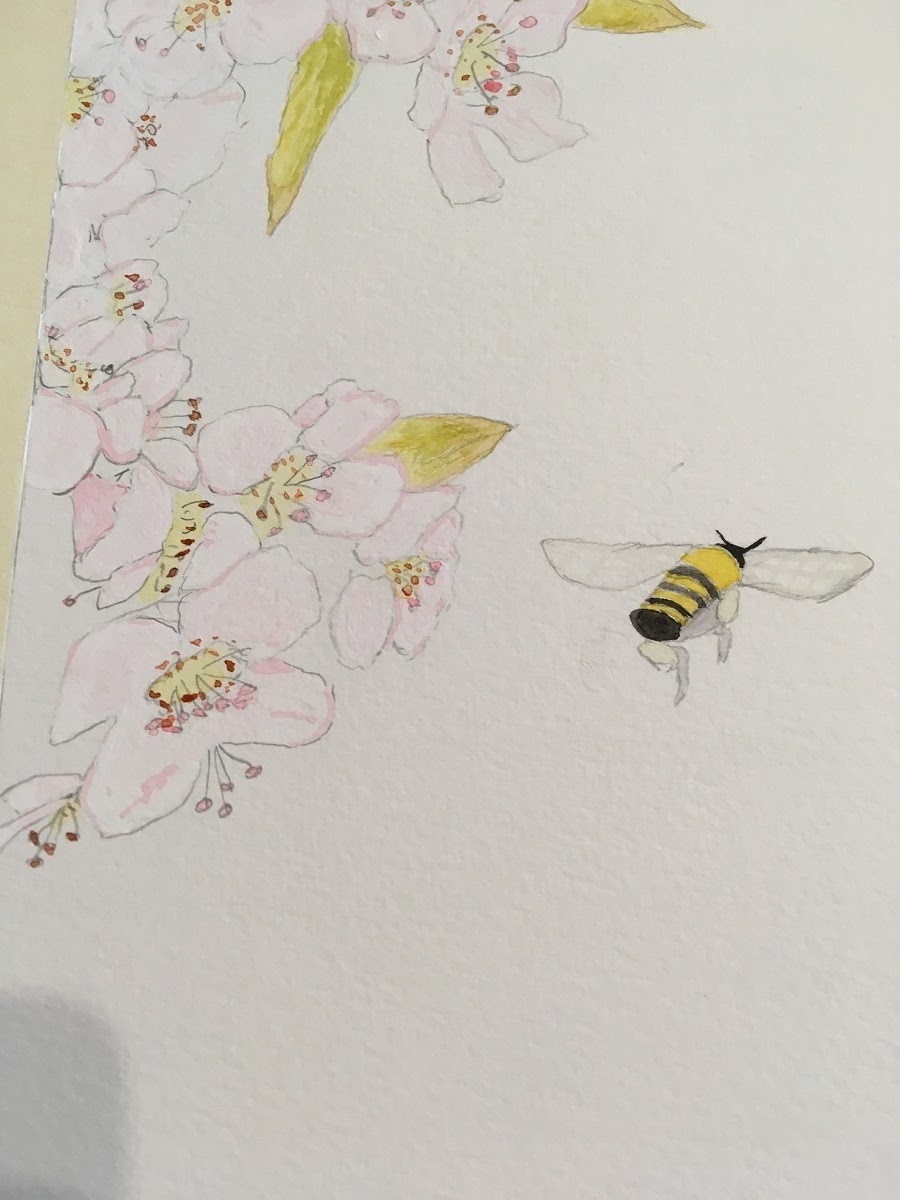
Week 6: Garden
It has taken me quite awhile to decided on the subject for this week's topic, many ideas were sketched and discarded. Finally I chose the Manchurian Pear blossoms with a bee - I photographed the blossoms in the Spring of 2015. The biggest decision was how to represent the generally white flowers? Gouache with Watercolour in a variety of tints. I made the decision to leave the background white and gave it a black boarder.

Upon completion the illustration kind of reminds me of two things from my teenage years;
1. A poster of Japanese cherry blossoms that hung in my room.
2. The chickadee and blossom cross stitch I made when I was 17 years old.
Materials used:
- Pencil HB
- Watercolour Paper 300gsm, cold pressed, grain medium (Canson)
- 0.8 Staedlter pigment liner
- Gouache
- Daler Rowney - Permanent White
- Water colour paints
- Winsor & Newton
- Winsor Yellow
- Winsor Red
- Art Spectrum
- Raw Sienna
- Neutral Tint
- Lamp Black
- Lemon Yellow
- Cadmium Yellow
- Ochre Yellow
- Aureolin
- Hookers Green Permanent
Family Photos used to inspire illustration.

Illustration in development.


Week 5: Peacock
This week I have chosen the medium of 2D collage to create the peacock illustration. While I originally thought i would use a range of tissue papers that overlapped, upon entering the art store the potential peacock papers called to me and the illustration became a paper piecing collage rather than a see though layering illustration.
Materials used:
- Paper;
- magnetic cardstock
- cardstock
- printed handmade paper and
- tissue paper
- Jasart Sketch Paper - A2 Heavyweight Backing 110gsm Cartridge Paper
- Elmer's Glue-All Multi-purpose glue (extra strong formula)

Family Photos used to inspire illustration.


Illustration in development.


Now to add the face markings, eye and beak.


Adding the plumage on the head. (pictured with the original sketch, the photos and papers)

Week 4: Ode to favourite children's book
It took me a little while to decide which story and then I had even sketched an illustration onto watercolour paper for "Where the forest meets the sea." and then changed my mind to Rapunzel.This is the moment in the story when the prince hears Rapunzel sing and asks her to let down her hair.
The trees probably need more light and shade but I'm not sure if that will just lead to too much reworking? This is something that I will work on in my next illustration.

Materials used:
- Pencil HB
- Gummed Water Colour Paper 140lbs/300gsm, cold pressed/not, grain fine (Winsor & Newton)
- Water colour paints
- Winsor & Newton
- Winsor Yellow
- Winsor Red
- Art Spectrum
- Raw Sienna
- Burnt Umber
- Neutral Tint
- Lamp Black
- Cerulean Blue
- Cobalt Blue
- French Ultramarine
- Ultramarine Blue
- Lemon Yellow
- Cadmium Yellow
- Ochre Yellow
- Cadmium Red
- Hookers Green Permanent
Additional Resources: I watched the You Tube videos to get guidance in selecting colours for the forest and how to paint a forest background and simple trees.
- Quick and Easy Background Trees with Barry Whitehouse
- A Simple Tree Watercolour Demonstration by Peter Woolley
- How to paint a simple tree by Grant Fuller
- How to paint a group of trees with watercolour by Chris Berdoll
Family Photos used to inspire illustration.


Illustration in development.

Week 3: Australiana
This week was a new challenge for me. To actually commit to adding watercolour (wet pigment) to my drawing plus try creating waves. My illustration was inspired by my a family photo. I still need work on developing the wave painting skills but all in all I am fairly happy. See below from more photos.
Materials used:
- Pencil HB
- Gummed Water Colour Paper 140lbs/300gsm, cold pressed/not, grain fine (Winsor & Newton)
- Gouache
- Daler Rowney - Permanent White
- Water colour paints
- Winsor & Newton
- Winsor Yellow
- Winsor Red
- Art Spectrum
- Raw Sienna
- Cerulean Blue
- Cobalt Blue
- French Ultramarine
- Antwerp Blue
- Aureolin
- Rose Madden
Family Photo used to inspire illustration.

Illustration in development.


Week 2: Feathered animals
I have found it interesting to watch my drawing grow.

Materials used:
0.2 Staedlter pigment liner
Cream pastel paper
The initial drawing was of the flying bird. I probably drew over 50 birds while sitting on my balcony one evening.Now I had the bird I needed to put it into a landscape, so I added a tree. The flowers in the foreground have been in my past drawings and found their way into this one. Then suddenly the North Wind made an appearance when I wanted to add in patterns to the sky that could represent the air. Then the final love birds in the tree. At this point I thought stop before you do too much and muck up the whole composition, sometimes less is more.
Week 1: Whimsy
"All the shops are closed but you can still get ice cream at the movies!"

Materials used:
A4 Printer paper
0.2 Staedtler pigment liner
Faber Castell Watercolour pencils
Initially I draw the illustration in pencil and then photocopied it (a suggestion from Leigh Hobbs). I did this so I could work it several ways without the fear of stuffing up my original work.
No comments:
Post a Comment